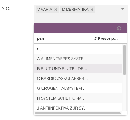
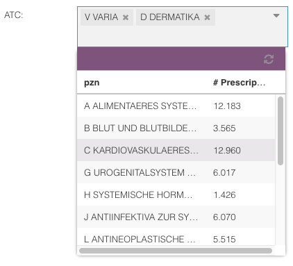
xplain.ux.widget.TagCombo
Provides a combo box that basically takes an attribute’s ID (e.g.
Patient.DoB.Age) as input, and generates a combo box that depicts all (root) states of this attribute. In contrast toxgridcomboaxtagcombolet’s you select multiple states!
The user may later on trigger a query that fetches the
COUNTof the specified object and depicts this measure.
Example:
var gridcb = Ext.create('xplain.ux.widget.TagCombo', {
      attribute: 'Person.Gender.Gender',
      dataBind: true,
      x: 100,
      y: 100
});
xtagcombo extends [Ext.form.field.Tag](http://docs.sencha.com/extjs/6.2.0/classic/Ext.form.field.Tag.html). Thus, all properties / methods / etc. like for instance
autoSelect,emptyText, etc. can be used.# Attention!
Due to a known bug in ExtJS it is currently not possible to set the value of a TagCombo. This means, you can use the TagCombo to select a set of states. However, a TagCombo cannot be used to show the current selection.
Config Parameters
- dataBind = true
If set to true, this component will be bound to the data the backend returns. This means it will automatically set a global selection in Xplain as soon as the user selects a state in this xgridcombo. The selection will comprise all states currently selected for this attribute. Furthermore, each selection set (within any other component or query) that changes the selection set on this attribute will be reflected here.
- traditional = true
If set to true, this component will not have a header nor a title. Thus, it also will not have an option to show the
COUNTof the specified object.